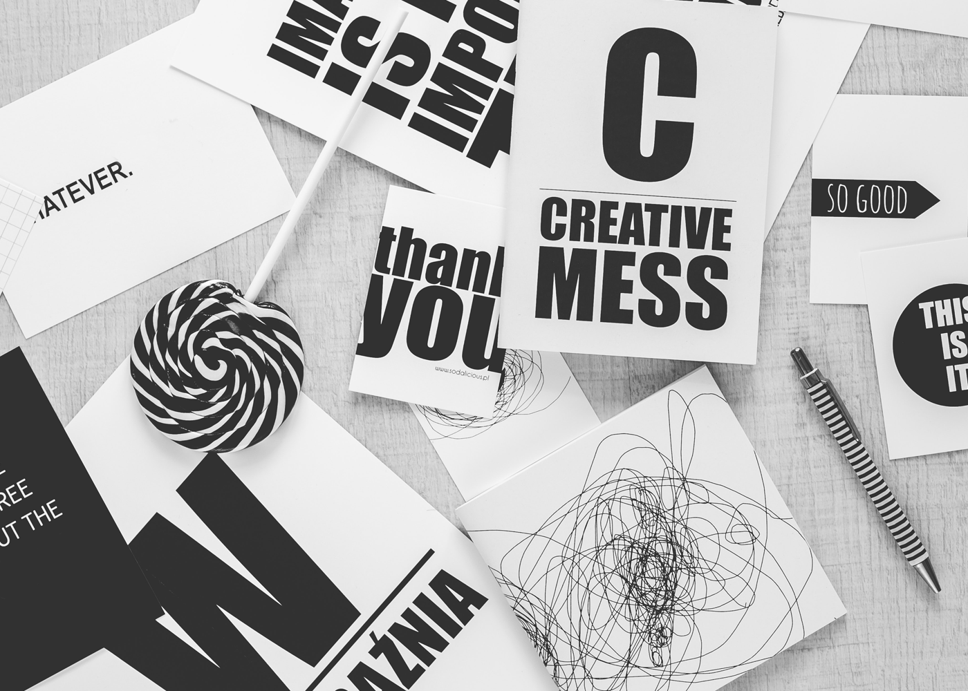
People don’t understand typography. Bold statement right? What I mean by this is people have little knowledge about type and why it’s so important to designers and why we freak out every time a client uses times new roman, papyrus and the dreaded comic sans as their font of choice.
In my first year of typography class, I also didn’t understand why it was so important. I mean, I understood the right font gives your brand a voice. If you’re a company for kids you don’t want times to be the font of choice. But I didn’t get the extended labor typographers put into type. I remember my college typography teacher telling my class, “Once you done with this class you’ll never think of typography the same. You won’t be able to walk down the street and not notice a sign with bad or good type. People will think you’re crazy.” It’s true. You notice the thickness and thinness of letters. You notice the balance of space between them, in them and around them. You notice the special details designers and typographers add to a type logo to make them “special”.
That’s what this is about. You’ll notice these logos; you’ve seen before a bunch of times and never thought twice. Until you switch out their font to the closest one you can find on your computer. You start to notice the unique qualities these letters have and you start to appreciate them.


P.S. Westminster is awesome at typography. Check out our branding and contact us if you need some font love.
Source: Ladd Design